Quantcast
Channel: Photoshop – French Kiss Collections, photography and design resources and tutorials
Viewing all 14 articles
Browse latest View live

Using Adjustment Layers in Photoshop

$
0
0

Note: this was originally published in my old Photo Artist Textures blog.

Adjustment layers are an essential part of post-processing. They allow you to make changes such as tonal adjustments to your image non-destructively. I remember the days before Photoshop 4 when we had to save endless variations of files and lived in fear of over-writing the master file. With adjustment layers, you can make a change and if you decide later it’s not what you want, you can change it without any damage to the file. (The more you make changes to a file such as tonal adjustments, the quality degrades.)

This tulip image needs some post-processing love. It has a slightly yellow cast and needs contrast.

Tulips

Original Image needs some post-processing love.

To apply a Levels adjustment layer, select the New Adjustment Layer icon at the bottom of the Layers Panel. A drop down menu appears. As you can see, there are a number of choices.

Adjustment layer

Select the New Adjustment Layer icon.

After selecting Levels from the menu, a Levels Adjustment Layer appears in the layer panel.

Level adjustment layer

At the same time, the Adjustments Panel opens up and I can make my tonal adjustments.

Levels

I brought up the highlights and took out some yellow.

Tulips Adjusted

Levels adjustment of contrast and yellow cast correction.

We can apply several adjustment layers if needed. Next, I’ll add a Hue / Saturation Adjustment Layer. I didn’t show the step, but as above, select the new adjustment layer icon and select Hue / Saturation from the menu.

Hue / Saturation Adjustment Layer

The Adjustments Layer Panel opens to Hue / Saturation.

Hue / Saturation Panel

I selected Reds and used the Hue slider to make the tulips more purple. I then used the Saturation slider to increase saturation.

Tulips with a Hue adjustment

Reds are adjusted and saturation increased with Hue/Saturation.

Did you notice that the adjustment layers have layer masks? Just to demonstrate what can be done, I further adjusted the Hue/Saturation so that the tulips turn more purple and I then painted over certain tulips to retain the red that was in the original. In this case, it’s a rather garish result but this is often a handy feature.

The Adjustment Layer effect can be selectively applied with a mask.

Remember the Layer Masks!

Hue layer mask

Garish, but you get the idea of how to selectively apply adjustments with a layer mask.

In another tutorial, we’ll learn to use clipping masks to apply adjustment layers to selective layers.


Post-Processing Rocks! Using Lightroom, Photoshop & A Topaz Labs Filter

$
0
0

I get a lot of emails asking me how I get my images to look clear and crisp and I’ve had questions asking me about how I use the Topaz Labs filters. This is a good opportunity for me to do a demo of how I capture and process my images. Let’s take a look at how I created this still life Solo Quince.

Capture Details

This image was shot in my studio using natural light and reflected flash fill.

  • ISO 100, f/11, 1/6 second, RAW format
  • Canon 40D
  • Canon 60mm macro EF-S f/2.8

First Edits In Lightroom

I love Lightroom. It’s become an essential part of my workflow. All RAW images need some processing.

Here’s my RAW image before Lightroom adjustments.

Raw Image

Straight Out of Camera, RAW—no adjustments

Next, I’ll do some basic adjustments in Lightroom.

Lightroom adjustments

RAW image with Lightroom adjustments

 Lightroom Adjustment Details:

  1. White Balance: Whenever I can, I start with a white balance adjustment. White balance needs to be done on a neutral color like white, gray or black. Here, I chose the white background.
  2. Exposure + .25: Tip: always go too far in both directions in exposure to gauge correctly.
  3. Clarity + 43: Tip: I usually find the Lightroom Preset: General/Punch works well as a starting point for my images. This will add Clarity and Vibrance.
  4. Vibrance +14
  5. Sharpening: 50 (this is adds a little pre-sharpening—all RAW files need sharpening.)

Further Adjustments in Photoshop

Although Lightroom is quite powerful, I’m just more comfortable doing my edits in Photoshop.

Photoshop Edits

Further processing in Photoshop

 Photoshop Edits

This is my standard workflow for processing my “base edits” in Photoshop.

  1. Exposure: I start by doing further edits to the exposure. I usually use a Levels Adjustment layer to fine-tune the exposure and contrast. There are probably those that would argue I should do this in Lightroom, but I just feel more comfortable with Photoshop.
  2. Crop: I thought there was too much of the wooden base showing.
  3. Retouching: I then retouch out any distracting elements like dust, bugs, etc.
  4. Burn/Dodge: Anyone who has ever worked in a darkroom had a kit for finessing localized exposure. The same is true for digital. It’s rare an image couldn’t stand a bit of burning & dodging. In a future tutorial, I’ll show you how to use a burn/dodge layer, which is much better than the Photoshop Burn/Dodge tools.
  5. Merge Visible: Next, I’ll merge my base edits together so I can run a Topaz Labs filter. Tip: the keyboard shortcut is Command+Option+Shift+E (Mac) or Control+Alt+Shift+E (PC)
The Layer Panel

The Layer Panel

The Final Touch: A Topaz Labs Filter

Here’s the Final Image comparison.

Note: I’m no longer using image mouse-overs for the Before/After as they do not work on touch devices such as iPads.

Raw Image

Straight Out of Camera, RAW—no adjustments

Final edits

Image with based edits & Topaz Labs Detail Filter

Topaz Labs Filter Info

  • Topaz Labs Detail 2 filter: I have created a preset for the Detail 2 filter called Feature Tweaked that is a slightly stronger effect than just the Feature Enhancement (which is the mildest setting.) Tip: immediately name your layer with the filter you run. That way, if you want to re-edit in the future, you’ll have a reminder of what you did.
  • I’ve never tried this before, so cross my fingers that this works, but I’ve exported my Feature Tweaked preset. Click the Feature Tweaked link to download it, unzip it and Import this into your Topaz Labs Detail 2 presets.

It’s harder to see in these web images as I’ve used a delicate touch with the filter, but it does make a difference. A lot of the default presets in the Topaz Labs filters can be too strong. Play with tweaking them for more pleasing results. I’ll cover more of my favorite Topaz filter settings in future tutorials.

Next: Texturing The Image

Next week, I’ll do a tutorial on adding a texture to this image.

P.S. Yes, I will get an affiliate commission if you happen to buy a Topaz Labs filter by clicking through on one of these links. I love these filters and think you will also find them valuable. Thank you for your support.

Photoshop Keyboard Shortcut: Copy Visible and Paste In A New Layer

$
0
0

This Photoshop keyboard shortcut will copy all the visible layers and merge them into a new layer. I use this handy shortcut with with nearly every image.

Let’s say I’ve added an adjustment layer to my image plus a burn/dodge layer, clone layer, etc. Now I want to apply a filter to the final result. I could flatten my image, but then I’ve lost the ability to edit those adjustments in the future. An easy way to accomplish this is to create a new layer that is a copy all of the layers and merge them into a new layer.

The Shortcut

Select the top layer to make it active, then press Command-Option-Shift-E (Mac) or Ctrl-Alt-Shift-E (PC).

Tip: This will create a merged copy of all the visible layers even if they are above the selection point, so make sure you’ve turned off any layers you don’t want merged!

Copy merged

Merged copy of the layers below.

This can also be handy if you need a merged copy of your textured image to place in a template or frame.

Using The Oil Paint Filter In Adobe Photoshop CS6

$
0
0

I’ve written before about using the free Pixel Bender Oil Paint filter for Adobe Photoshop CS5. I just upgraded to Adobe Photoshop CS6 and was ecstatic to find that the Oil Paint filter is now included. They’ve made a few changes to the settings that I both like and don’t like.

I’ve chosen this simple poppy photograph to demonstrate the changes and give you my own “secret sauce” for using the oil paint filter in combination with a Topaz Labs* filter to get the effect that I want.

Final Image

Image with the Photoshop CS6 Oil Paint and Topaz Labs filter


Original

Original image.

 The Pixel Bender Filter and Photoshop CS5

The Pixel Bender filter is a free filter that works with Adobe Photoshop CS5. The filter has several effects, but honestly, besides the Oil Paint filter, I didn’t see much use for the others. I love how the Oil Paint filter enhances details especially on plants and animal fur in a soft, undulating way. I usually added a Topaz Labs* filter to up the detail and contrast. (See Combining Textures And Filters In Photoshop For A Painterly Look.)

As much as I loved the filter, it had a few problems. The interface was finicky and the hardware processing needs were so demanding that I had a very difficult time running it on my 4 year old iMac (I’ve since upgraded my Mac.)  It got to a point where I never used it because it was so much of a hassle. It was also difficult to see exactly what you were getting in the preview window.

The Photoshop CS6 Oil Paint Filter

When I upgraded to Adobe Photoshop CS6 over the weekend, I was thrilled to find that the Oil Paint filter is now a part of Photoshop! I’ve been playing around with it this week and here are my initial impressions. I’m now using the filter on a new, fast iMac so I can’t compare the processing needs exactly, but overall, it just seems more responsive and the preview is great. Photoshop has made some changes to the Oil Paint effects that I don’t much care for though.

Panel Comparison

The New Oil Paint Interface (right)

The first difference I noticed is in the Stylization setting. In Pixel Bender, it controlled how swirly the effect was. Now, it goes from a textured, pebbly effect to a swirly effect. I don’t much care for the pebbly effect, but I can see how some might like it. Cleanliness tends to mellow out the contrast and intensity of stylization. I usually set this pretty high because I like the swirly look of this filter, but not the pattern of it. The other settings mostly effect the intensity and scale of Stylization and Cleanliness. The Shine setting will give more contrast to the filter, but it will also emphasize the pebbly or swirly texture.

Style and Shine

Example: Stylization low, Cleanliness fairly low, Some Shine

Even when I increase the Stylization and Cleanliness all the way up, if I add any Shine I get this unwanted pattern.

Some shine

Stylization and Cleanliness at 10, Shine 1

If I put the Shine setting to 0, it takes out the pattern, but leaves some of the desired painterly feeling to the image. (The effect is easier to see in the images following this one.)

No Shine

Stylization and Cleanliness 10, Shine 0

My Secret Sauce

To get the look of the Pixel Bender Oil Paint that I liked, I jack the Stylization and Cleanliness effects up all the way and completely turn off Shine.

Quick update: I’m finding that if I have Shine turned off, I can play with the Cleanliness setting to modify just how soft and swirly the effect is. Depending on the image, a much lower Cleanliness setting may be desirable. Try each extreme of the Cleanliness filter to see which direction works best for your image.

Tip: I’ve found I usually need to increase contrast with a levels adjustment after I run the Oil Paint Filter.

No Topaz

Stylization & Cleanliness 10, Shine 0, No Topaz Filter

You may find that the Oil Paint filter alone works well for your purposes. I love detail, so I usually add a Topaz Labs* Filter. I usually use Topaz Labs Detail 2* with the Creative Detail Accent preset. I’ve perhaps exaggerated the effect a little here for illustration purposes. You can play with the settings or the opacity of the layer to get the effect you want.

With topaz

Oil Paint Filter With Topaz Labs Detail filter

Topaz Labs Filters is an affiliate link. I get a small commission from any sales resulting from a click from this site (at no extra cost to you.) I really do love these filters. Nearly all of my own images use one of these filters. Thanks for supporting the site.

Are you using either the Pixel Bender Oil Paint filter or the Photoshop CS6 Oil Paint filter? What do you think? Show us your results on the Facebook page and compare notes.

Open PNG Files With Photoshop or Elements On A Mac

$
0
0

A lot of my digital files that have transparent areas such as overlays, frames, tape are saved in the .png file format. The problem is that a Mac is set to open these types of files in the Preview application. To open in Photoshop, I’ve been dragging them to the Photoshop icon. Sometimes I would forget and double-click a file to open it and it would open in Preview. This has been driving me nuts for some time, so I finally did a search on how to change the default application that opens a specific file format.

Of course, it’s easy-peasy.

Finder

Change the Default Application That Opens .PNG Files On A Mac

  1. Just select any .png file in your finder window. (See Above)
  2. Open up the Get Info window (Command + i).
  3. Select which application you want to open .png files with. (For me it was Photoshop CS6 – you can choose your version – or Elements)
  4. And then Click on the button that says Change All.
  5. Sigh in relief.

Get Info

I’m not sure how to do this on a PC. Anyone want to write a PC version?

Using OnOne Perfect Effects To Add Snap To A Floral Photograph

$
0
0

Hydrangea final

I’m often asked how I to get crisp details and bright tones in florals. Of course, getting a good capture to begin with is the most important step, but we’ll cover that another time! Using Photoshop filters is a great way to enhance details, open shadows, and sweeten tones.

Below is my image with very basic levels adjustment and slight burn / dodging. I’ve applied some pre-sharpening of about 50% in Lightroom. (Note: this is a cropped view of the image above to see details better.)

Before filter

And now the same image adding a filter from onOne’s Perfect Effects.

Settings:

  • Color & Tone/ Lighten Shadows
  • Plus, Movie Looks: Punch Drunk (at 50%)
  • Plus, Detail: Amazing Details (at 50%)

After filters

Texture Details

Per request, I’m adding the texture details for this image.

First Texture

I thought the colors in Secret Garden from the Tableaux Collection would go nicely with this image. I used a blend mode of multiply at 100%. I also added a levels adjustment layer to brighten the highlights and take out a little of the yellow in the texture. The adjustment was confined to the texture with a clipping mask. (see tutorials that have information on clipping masks.) The image below is after I used a layer mask to remove texture from the flower, bowl and saucer.

Secret garden texture

First Texture added

Second Texture

I liked this combination, but I wanted to break up the texture a bit to create more depth between the foreground and the background. I then placed Fresco, which is a more neutral painted texture under the Secret Garden layer. This is also set to Multiply at 100%.  I repeated the levels adjustment used with secret Garden with this texture. To reveal more of Fresco, I used a layer mask on Secret Garden and used the gradient and brush tools. (See layer panel below.)

Overlay

I thought the composition needed a little something, so I then added an overlay from the Vintage French Photo Studio No.2. I changed the color with a solid color adjustment layer and a clipping mask. I added a layer mask and then used a grunge brush to mask out areas of the overlay.

Finally, I added a levels adjustment layer to brighten the highlights overall in the image. I’ve found I often need to do this after adding textures when I’ve used the multiply blend mode.

The Layer Panel

Here’s my layer panel from Adobe Photoshop CS6. Note that I have grouped my textures and overlay and applied a layer mask to the group where I did my basic masking of the flower, bowl and saucer. This may not be possible in Elements. Just do your initial edits that pertain to all textures and then option (mac) or alt (pc) drag the layer mask to each layer. (see tut) Then, proceed with additional masking on each layer.

Layer Panel

Layer Panel (Photoshop CS6)

Resources:

Secret Garden and Fresco from the Tableaux Collection and an Overlay from the Vintage French Photo Studio No.2.

Visit The Shop

Creating A Photo Illustration Effect With Watercolor Brushes: Part 1

$
0
0

I’ve had a lot of requests for a tutorial on how I created this image of a French Castle that looks like it’s an illustration.

Chateau de Chinon as a photo illustration by Leslie Nicole

A Tutorial In Four Parts

While this technique is pretty simple, I wanted to cover a lot of the different options involved which would make for a very long, complicated tutorial. (Which is why I’ve been procrastinating on it!) I’ve decided to break it down into manageable sections, so I’ll be doing this tutorial in four parts.

  1. The Overview: (This post) An introduction, overview and a road map for the tutorial break down.
  2. Preparing the Color Image: In the next post, I’ll cover ways you can prepare your color image such as using filters.
  3. Creating a Line Illustration Effect: In this post, I’ll cover several different ways to create a black and white line drawing of your color image.
  4. Putting it all together: In the final post, I’ll show you the details of how it all works together, including using watercolor brushes in the layer mask.

An Overview

This technique is very popular in digital scrapbooking.

The Elements

The Color Photograph

Travel images seem to be well suited for this process. This is a photograph I took of the Château de Chinon in France (my husband’s birth place!) I’ll cover the processing information in the next post.

Chateau de Chinon by Leslie Nicole

The Line Illustration

From the color image, we create a line drawing effect. I’ll show you the various ways to create this effect in Part III.

Line Drawing Effect Chateau de Chinon

A Texture Background

The background would be either the scrapbook page or in my case, a texture. A background that is plain and light is probably the best bet. This texture is Serene, lightened and desaturated from the French Kiss Les Textures 3 Collection

French Kiss Collections Texture Background

 The Layers

Here’s a simplified version of my Layer Panel in Photoshop. (I’ve taken out minor tweaks specific to my image to show the essence of the technique.)

From the Top Layer Down:

  1. The original color image is set to a Normal Blend Mode at 80% Opacity. I used Photoshop watercolor brushes (spot and spatter) on a layer panel filled with black to reveal some of the color photo.
  2. The line drawing version is set to multiply at 100% opacity. Again, I used Photoshop watercolor brushes on the layer mask. In this layer mask, I extended how much of the layer is revealed beyond how much the color is revealed so you get the look that the color is added onto the drawing.
  3. The texture background.

Photoshop Layer Panel showing illustration technique

That’s a quick overview of the steps we’ll be covering in the tutorial.

  1. Part 1: An overview of what will be covered. (This post)
  2. Part 2: Preparing the Color Photograph.
  3. Part 3: Creating the Black and White Line Illustration.
  4. part 4: Putting it all together and using the watercolor brushes.

Resources

You can find Photoshop Watercolor Brushes and Textures on French Kiss Collections.

Creating A Photo Illustration Effect With Watercolor Brushes: Part 2

$
0
0

This is part 2 of the 4 part tutorial on creating this photo illustration effect. (Part 1 is an overview of the entire tutorial.)

Chateau de Chinon as a photo illustration by Leslie Nicole

Choosing and Preparing The Color Image

This post is divided into 3 parts.

  1. Choosing and preparing an original image.
  2. Examples of the original image using different filter effects.
  3. Those filter effects used in the photo illustration.

Choosing An Image

This technique seems to work best on images with a fair amount of detail, particularly detail along the edges of the image. Travel images often work well.

Basic Image Processing

Do any basic image processing such as exposure corrections that you normally do. I won’t cover basic image processing in-depth in this tutorial, but I have included notes about this image.

My original image

Below is the SOOC photograph I took of the Château de Chinon in France. Actually there may have been a bit of exposure adjustment in Lightroom, but it’s pretty close to SOOC.

Chateau de Chino original

Original Image before post processing.

Final Processing.

This is with dodging to bring out the luminous quality of the stones on the castle and slight color overlays applied with  brushes to enhance the touches of gold. I also applied Topaz Lab’s Filter, Detail*.

Chateau de Chinon by Leslie Nicole

Processed Image

Retouching

Since my goal was a vintage/artistic effect, I desaturated or retouched out minor details that looked too modern such as visible, bright colored signs and cars.

Retouch Details

Zoomed in view of areas to desaturate or retouch.


Creative Processing

You may wish to enhance the photo illustration effect by doing further creative processing to the color image. A great way to add more of an illustration effect is with 3rd party Photoshop filters. Some of the results below may be too stylized for stand-alone photos, but I wanted you to see the originals as well as the effect when combined with the illustration.

Be sure to save a copy of the original color image before trying the creative effects. Duplicate the layer.

Filter Forge

In the last post, I showed an example of using a filter in Filter Forge with this image. I used the Paint HDRtist filter by Filter Forge contributor, lipibianc.

Chateau de Chinon by Leslie Nicole

Topaz Labs Simplify

Below, I used the Buz Sim preset in Topaz Labs Simplify.* They do have a watercolor preset, but I haven’t managed to get results I like yet.

Chateau de Chinon by Leslie Nicole using Topaz Simplify.

Alien Skin Snap Art

I haven’t been using Snap Art long, but I’m loving it so far. I used the Detailed Watercolor preset in Alien Skin’s Snap Art filters.

Chateau de Chinon by Leslie Nicole

Topaz Labs Adjust

Finally, I thought I’d try Topaz Labs Adjust*. I used the HDR Sketch Light preset. Although the following example looks a bit too harsh for a stand-alone photo, as part of the photo illustration (see Final Comparisons below) it works.

Chateau de Chinon by Leslie Nicole


Final Comparisons

Original Processing

Chateau de Chinon as a photo illustration by Leslie Nicole

Filter Forge

Paint HDRtist filter

Photo Illustraton using Filter Forge

Topaz Labs Simplify

Buz Sim preset with adjustments. I increased the details setting.

Chateau de Chinon by Leslie Nicole using Simplify.

Alien Skin Snap Art

Watercolor – Detailed preset.

Chateau de Chinon by Leslie Nicole using Snap Art.

Topaz Labs Adjust

HDR Sketch Light preset.

Chateau de Chinon by Leslie Nicole using Topaz Adjust

 Which version do you prefer?

Creating A Photo Illustration Effect Using Watercolor Brushes. A tutorial in 4 parts.

  1. Part 1: An overview of what will be covered.
  2. Part 2: Preparing the Color Photograph. (This post)
  3. Part 3: Creating the Black and White Line Illustration.
  4. Part 4: Putting it all together and using the watercolor brushes.

* Topaz Labs Filters is an affiliate link. I get a small commission from any sales resulting from a click from this site (at no extra cost to you.) I really do love these filters. Nearly all of my own images use one of these filters. Thank you for supporting the site!


Creating A Photo Illustration Effect With Watercolor Brushes: Part 3

$
0
0

This is part 3 of the 4 part tutorial on creating a photo illustration effect (see finished illustration at the end of the post.)
In this part I’ll cover creating a Line Art Illustration effect from a photograph.

Creating A Line Art Illustration Effect in Photoshop

I could have done this tutorial with the most commonly used method, but when I was researching how to do this, I tried many different techniques and I wanted to share a few with you. Each has a slightly different feel.

If you tried a really creative technique for your color image, use the original color image to make the line image. Be sure it’s the same exact size as the creative version so everything will align perfectly.

Method 1: The Find Edges Filter (easiest)

This is the method you will find in probably the majority of tutorials for this effect and it’s certainly one of the easiest. It does have the drawback of having no settings to fine-tune the results. They are what they are, although the results are usually sufficient.

  1. Duplicate your color image to the layer above. Command + J (Mac) or Control + J (PC)
  2. Convert the duplicated layer to Black and White. There are many methods to do this, but for simplicity’s sake, in the Photoshop menu choose: Image/Adjustments/Black & White.
  3. Find Edges Filter: In the Photoshop Menu, choose Filter/Stylize/Find Edges.

That’s it! Easy Peasy!

Line Illustration effect using Find Edges

Method 2: The Minimum Filter

This method is also easy, but a little harder than the Find Edges method above. It does have the benefit of having more adjustment possibilities.

  1. Duplicate your color image to the layer above. Command + J (Mac) or Control + J (PC)
  2. Convert the duplicated layer to Black and White. There are many methods to do this, but for simplicity’s sake, in the Photoshop menu choose: Image/Adjustments/Black & White.
  3. Duplicate the Black and White layer to the layer above. Command + J (Mac) or Control + J (PC)
  4. Invert the Duplicated Black and White Layer. Command + I (Mac) or Control + I (PC)
  5. Convert the Duplicated layer to a Smart Object. From the Layer menu, choose: Smart Objects / Convert to Smart Object. Note, I’ve made this method a bit more complicated making it into a smart object. You could skip this step, but it lets you go back in and make changes to the filter setting later if you want.
  6. Change the Blend Mode to Color Dodge. Don’t freak out — your image will disappear. This is normal.
  7. Apply The Minimum Filter. From the Photoshop Filter menu choose: Other/Minimum. When the dialogue box comes up, start with a pixel radius setting of 1 and then increase it by one pixel until you get the effect you want. (Preserve should be set to Squareness.) This is why I had you change the blend mode first, so you could preview the results in real time. Tips: The higher the pixel radius, the thicker the outlines are. If you find later that you want to change the look, just double-click on the filter in the layer panel.
  8. Tip: lowering the opacity of the layer that you used the minimum filter on will smooth the tones. I used an opacity of 79%.

Photoshop Minimum Filter Settings

Your setting may vary depending on your image size. The higher the pixel radius, the thicker the outlines are.

Line Illustration Minimum filter setting 1

LineIllustration_Minimum3

Method 3: Invert and Blur

This has the same steps as the Minimum filter method above except that it uses a Blur filter. I’ve seen some tutorials say use the Gaussian Blur filter and others say use the Box Blur filter. I didn’t see much difference between the two.

  1. Duplicate your color image to the layer above. Command + J (Mac) or Control + J (PC)
  2. Convert the duplicated layer to Black and White. There are many methods to do this, but for simplicity’s sake, in the Photoshop menu choose: Image/Adjustments/Black & White.
  3. Duplicate the Black and White layer to the layer above. Command + J (Mac) or Control + J (PC)
  4. Invert the Duplicated Black and White Layer. Command + I (Mac) or Control + I (PC)
  5. Convert the Duplicated layer to a Smart Object. From the Layer menu, choose: Smart Objects / Convert to Smart Object. Note, I’ve made this method a bit more complicated making it into a smart object. You could skip this step, but it lets you go back in and make changes to the filter setting later if you want.
  6. Change the Blend Mode to Color Dodge. Don’t freak out — your image will disappear. This is normal.
  7. Apply The Gaussian Blur Filter. From the Photoshop Filter menu choose: Blur/Gaussian Blur. When the dialogue box comes up, slide the pixel radius setting until you get the effect you want. The higher the setting, the smoother the image becomes. My setting was 61.9. If you find later that you want to change the look, just double-click on the filter in the layer panel.

Your setting will vary depending on your image size. The higher the pixel radius, the smoother the image. The top image has a pixel radius of 61.9 and the bottom 7.6.

Line Illustration Blur filter high

LineIllustration_Blur_low

Method 4: Topaz Labs Adjust Filter

After I learned all the above techniques, I realized that one of my Topaz Labs* filters would probably work. I liked  this setting in the Topaz Labs* Adjust filter.

  1. Duplicate your color image to the layer above. Command + J (Mac) or Control + J (PC)
  2. Select the duplicate layer and from the Photoshop Filter menu, open up the Topaz Labs* Adjust Filter. I used Adjust 5.
  3. Choose Effects: Stylized Collection from the top left panel and the Sketch – Pencil preset in the bottom right panel. Then in Global Adjustments in the right panel, play with the Detail settings until you get the settings that work for your image. I increased the Detail Boost setting and to a lesser degree, the Strength setting. I have to say, I’m rather loving this.

Note: Topaz Labs* Simplify also has pencil sketch presets.

Line Illustration Topaz Adjust

Comparing The Results

Let’s see how each one looks in our illustration. I have to admit they look pretty similar small like this! Look at the detail in the left side of the castle and on the bridge on the right side.

Method 1: The Find Edges Filter

Chateau de Chinon by Leslie Nicole

Method 2: The Minimum Filter

Chateau de Chinon as a photo illustration by Leslie Nicole

Method 3: Invert and Blur

Chateau de Chinon by Leslie Nicole

Method 4: Topaz Labs Adjust Filter

Chateau de Chinon by Leslie Nicole

Which do you Prefer?

I hope that wasn’t too much information all at once. I wanted to pass on all these techniques to you.

Creating A Photo Illustration Effect Using Watercolor Brushes. A tutorial in 4 parts.

  1. Part 1: An overview of what will be covered.
  2. Part 2: Preparing the Color Photograph.
  3. Part 3: Creating the Black and White Line Illustration. (This post)
  4. Part 4: Putting it all together and using the watercolor brushes. (Coming this week)

* Topaz Labs Filters is an affiliate link. I get a small commission from any sales resulting from a click from this site (at no extra cost to you.) I really do love these filters. Nearly all of my own images use one of these filters. Thank you for supporting the site!

Creating A Photo Illustration Effect With Watercolor Brushes: Part 4

$
0
0

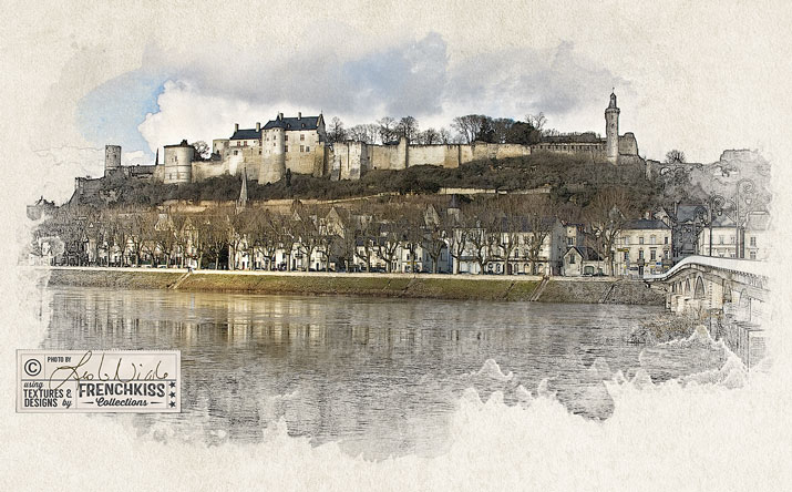
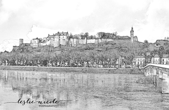
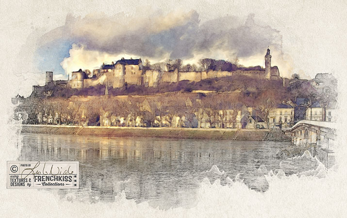
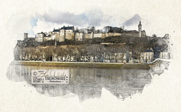
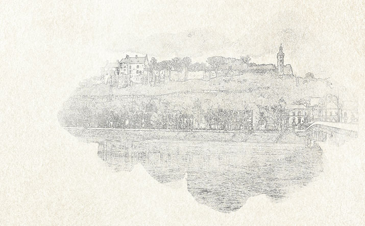
In this 4th and last part of the tutorial, we are going to put all the elements together to create our final photo illustration.
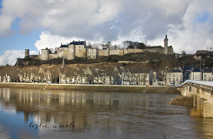
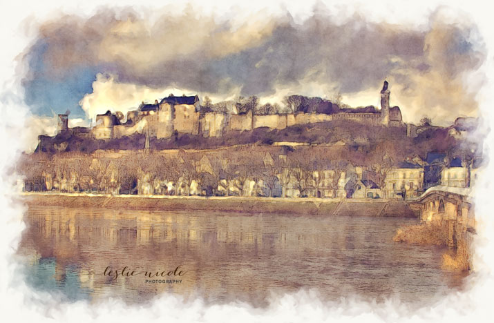
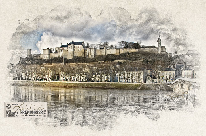
Chateau de Chinon as a photo illustration by Leslie Nicole

The Components For The Illustration

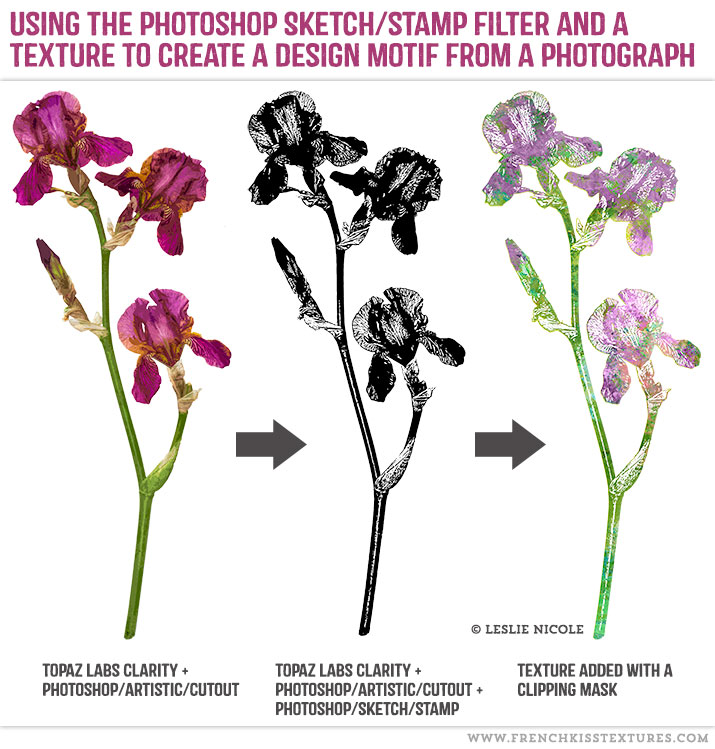
In part 1, I showed you how you will need 3 layers for the illustration.

  1. A Background Layer. Plain white works, but a lightly textured background is even better.
  2. A Color Image. In part 2, I covered creative options to prepare your color image.
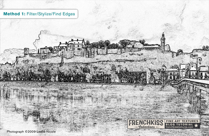
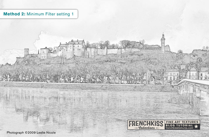
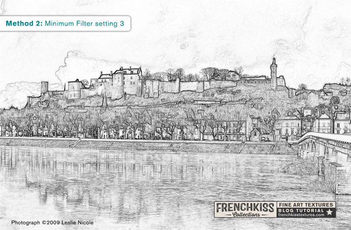
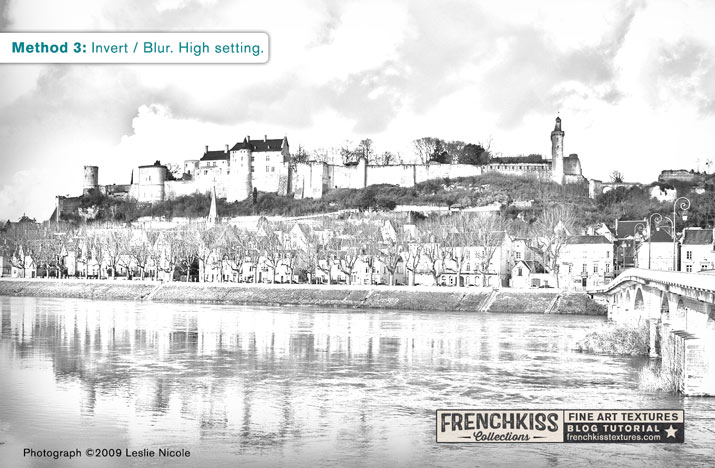
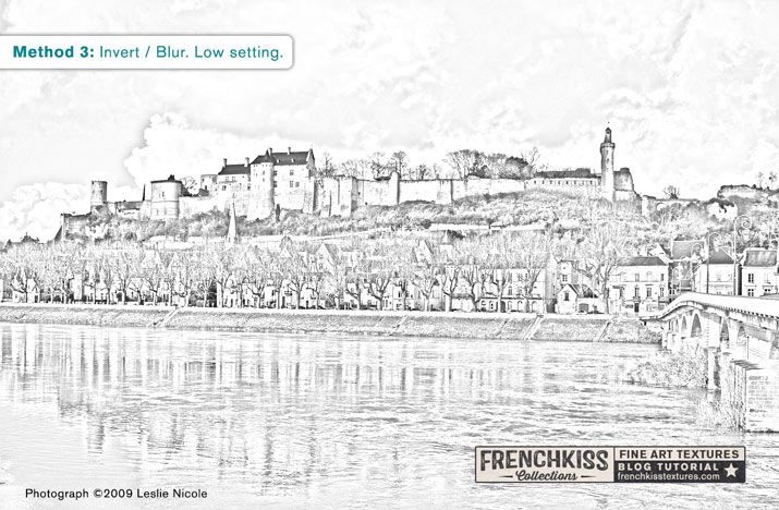
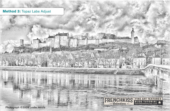
  3. A Line Illustration Version of the Color Image. In part 3, I showed you several techniques for creating a line illustration of your color photograph.

The Steps

The Background Layer

Open up the texture or digital paper that you will be using for your background. I recommend choosing a background that is fairly light and subtle.

Make sure your background image is larger than your color image.

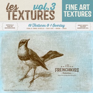
This texture is Serene, lightened and desaturated from the French Kiss Les Textures 3 Collection.

French Kiss Collections Texture Background

Placing The Color and Line Illustrations.

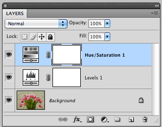
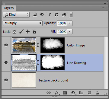
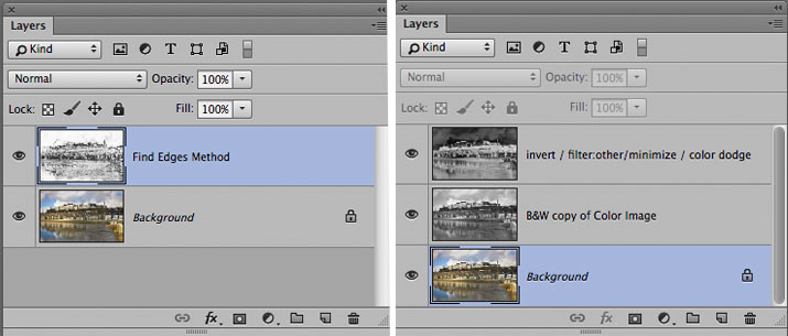
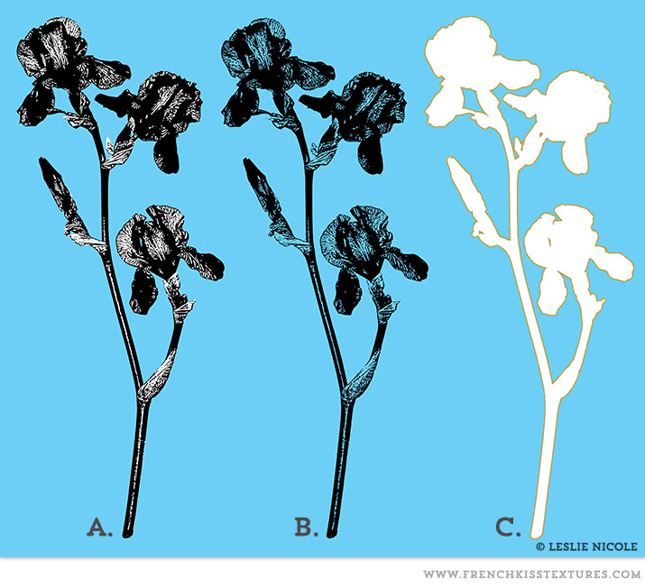
If you’ve been following along in the tutorial parts 1–3, you should have a document that has your color image and your line illustration together. Depending on the method you chose, you will have either 1 color layer and 1 line illustration layer or you will have 1 color layer and 2 layers for the line illustration.

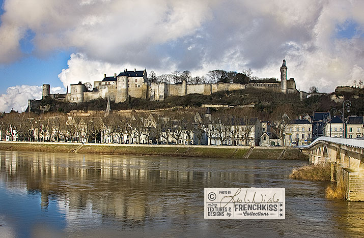
You will be placing the color and line illustration documents onto your background layer. It’s very important that your color image and your line illustration are the same size and same crop. Ideally, you will be taking them from the same origin document. Being perfectly aligned is essential.
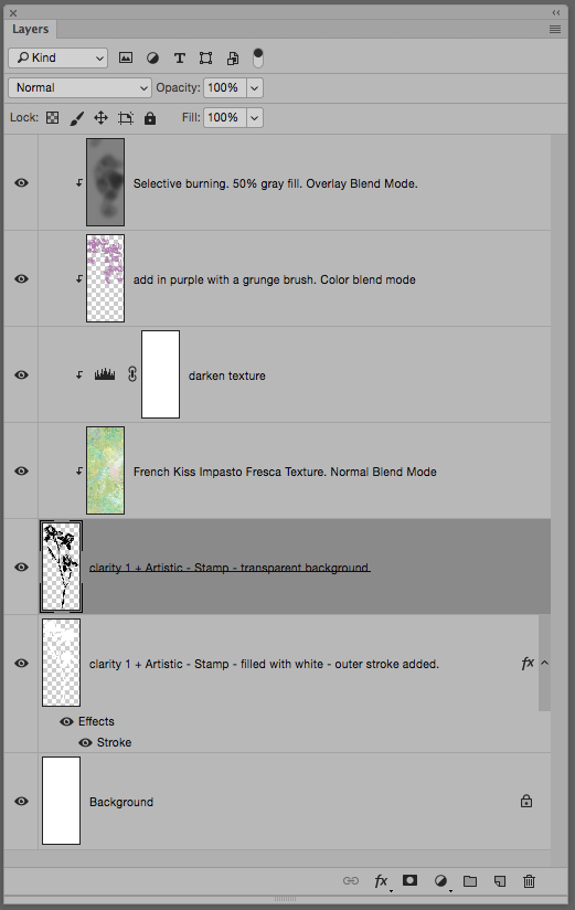
Layer Panel for color and line illustrations.

You may have 1 or 2 B&W layers depending on the method you used to create the line illustration.

Drag All Layers To the Background Document

Whether you have 1 or 3 layers, drag all the layers into your open background document:

  1. Select all the layers by holding down the SHIFT key while you select each layer.
  2. Still holding down the SHIFT key, drag all layers to the background document. Holding down shift as you drag will ensure that they are placed centered onto the background.
  3. If you have 2 black and white layers, select both of them (remember to hold down shift as you chose each one.) and merge these two layers. Command + E (Mac) or Control + E (PC).
  4. Drag the color image layer to the top layer position.
  5. For now, turn off the color image layer.

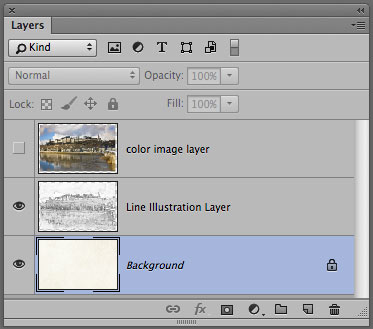
Your layer panel should now look like this:

Layer panel order for photo illustration

Your layers should be in this order.

The Line Illustration

We’ll now create the base of our illustration with the line drawing layer.

Add Guides

Let’s add some guides. (Note: this step isn’t essential, but it is helpful.)

  1. First make sure you have on Snap To Layers selected. Menu/View/Snap To/Layers.
  2. Turn on the Rulers: Command + R (Mac) or Control + R (PC)
  3. Drag out guides from the rulers until they snap to the edge of the line illustration. Do this for all sides.

Blend Mode

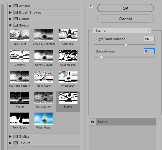
Change the blend mode of the Line Illustration Layer to Multiply.

Load Watercolor Brushes

Load up some watercolor brushes. (Tut: Installing and Using Photoshop and Elements Brushes.)  I like using some watercolor spots and spatters. I loaded up French Kiss Watercolor Spots 5 Brushes and French Kiss Watercolor Spatter 2 Brushes. Note: any brushes will work. Watercolor brushes are just an option that works nicely.

Choose a watercolor spot brush and hover it above your illustration to see it’s shape and placement. You may need to make the brush smaller by clicking on the left bracket key or bigger by clicking on the right bracket key. If you don’t see anything it’s either because the brush is still too big or you may have your Caps Lock button on. Turn off Caps Lock if needed and resize the brush to be smaller than your guideline area. Tip: to get your brush size small enough to visualize, change the size to a little smaller than your document width and then use the bracket keys to fine-tune the size.

If the right bracket key seems to stop working for enlarging the brush size, you’ve probably hit the size limit for brushes. In CS6 and above it’s 5000 pixels. In CS2 and below and Elements, it’s 2500 pixels. If your brush doesn’t fill the illustration, don’t worry, just build up multiple brush strokes.

At this point, don’t actually stamp the brush, just check the placement and shape by looking at the preview of the brush. Try to stay within the guide lines of the photo illustration layer.

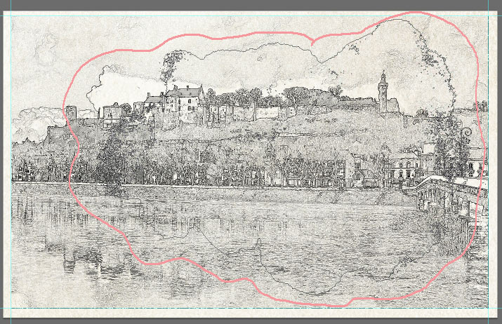
Below, I’ve taken a screen grab showing the faint outline of the brush preview and I circled around it in pink. You can also see the guides set up at the edges of the illustration. You’ll see why I’m having you do this in the next step.

Brush hover shape outlined in pink.

Brush preview hover shape outlined in pink.

Add a Layer Mask

  1. Select the Line Illustration layer.
  2. While holding down the Option (mac) or Alt (PC) key, click on the New Layer Mask icon at the bottom of the layer panel. It’s the dark rectangle with the white circle in the middle. This will place a layer mask filled with black. The Line Illustration will disappear. Don’t worry this is what should happen.

Use The Watercolor Brushes In The Layer Mask

  1. Make sure you have still have the brushes selected in the toolbox (shortcut is B) and that you have the layer mask selected in the layer panel.
  2. Make sure your color picker is set to white. (shortcut: D to take the color picker to the default Black/White and then X to bring the White to the foreground color.)
  3. Set to opacity of the brush to 100%.
  4. Choose a brush you want to try.
  5. Now, hover your brush within the guides in roughly the same place you did in the step above. This is why I had you test your brush placement before we added the layer mask.
  6. Click with your mouse (or Wacom tool).

This is the illustration with the first brush click. Wherever you paint (or stamp) with white will reveal the line illustration.

First watercolor brush placement.

The first watercolor brush stamp in the layer mask.

Continue to add brush clicks with different brushes revealing more of the illustration. Stay within the guides so that you don’t get a hard edge where the illustration ends.

Tips:

  • Save your work regularly.
  • If you get to a place where things are looking pretty good, but want to try more, think of either saving a snapshot (Photoshop History) of your work or saving a copy of the layer mask. I do this all the time. I’ll create a blank layer and copy the layer mask to it. option (Mac) or alt (PC) and drag the layer mask to the new layer. If I decide I totally blew it with my layer mask I can always replace the layer mask with the back-up layer mask.
  • Vary the opacity of the brushes and use some spatter brushes along the edges. You can  Use some watercolor drop brushes too.
  • You can also reverse the brush to black and take away some of the illustration if you go too far. Shortcut is X to switch the brush colors.

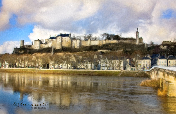
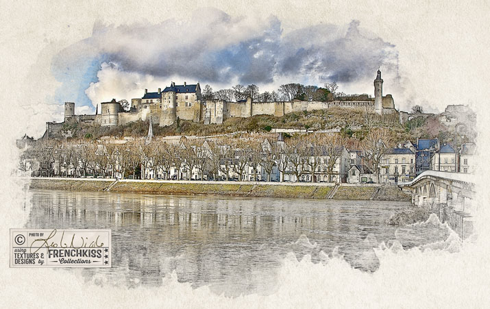
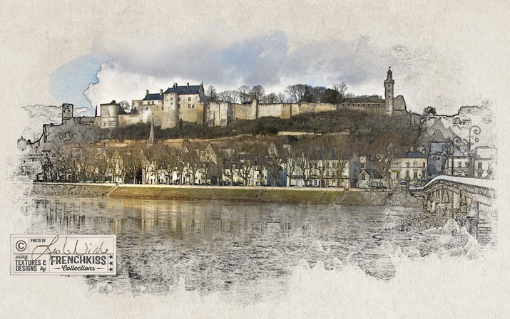
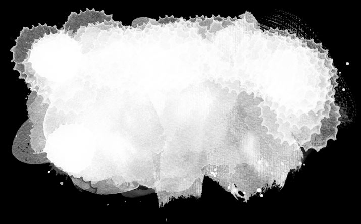
Here’s my final result this time around:

Leslie Nicole Chinon illustration

The Line Illustration with the layer mask.

And this is what my layer mask looks like. As you can see, it’s not fancy.

illustration layer mask

Illustration Layer Mask.

Note: I ended up also using brushes from French Kiss Watercolor Spot 5 Brushes and French Kiss Dry Brush Brush No.1. Both of those have a lot of texture to them.

The Color Image

OK, now that the line illustration part is done, let’s add back some color. Now, the idea of this step is to add back color selectively, leaving a lot of the line illustration showing—especially around the edges.

  1. Turn on the Color Image layer.
  2. Set the Blend Mode to Normal. Note: you could also try Multiply or other blend modes to see if you prefer that effect.
  3. You may want to slightly lower the opacity of the layer. Mine was set to 80%.

Add a Layer Mask

  1. Make sure the Color Image layer is selected.
  2. While holding down the Option (mac) or Alt (PC) key, click on the New Layer Mask icon at the bottom of the layer panel. It’s the dark rectangle with the white circle in the middle. This will place a layer mask filled with black. The Color Image will disappear. Don’t worry this is what should happen.

Use The Watercolor Brushes In The Layer Mask

  1. Make sure you have still have the brushes selected in the toolbox (shortcut is B) and that you have the layer mask selected in the layer panel.
  2. Make sure your color picker is set to white. (shortcut: D to take the color picker to the default Black/White and then X to bring the White to the foreground color.)
  3. Choose a brush you want to try.
  4. Start with the opacity of the brush at 100%, but undo and change it if it’s too much.
  5. Use brushes that are smaller than the line illustration area. See tips above for loading the watercolor brushes if you can’t see a faint preview of the brush.
  6. Start with the center areas of the illustration being careful to leave areas that aren’t covered with color.
  7. Vary the opacity of the brushes.
  8. I like having a strong effect in some edge areas so you can see the watercolor shapes, but softer, more blended areas in other places.
  9. In addition to stamping with a brush, try painting with a watercolor spatter drop brush—one of the single splat or drop versions.

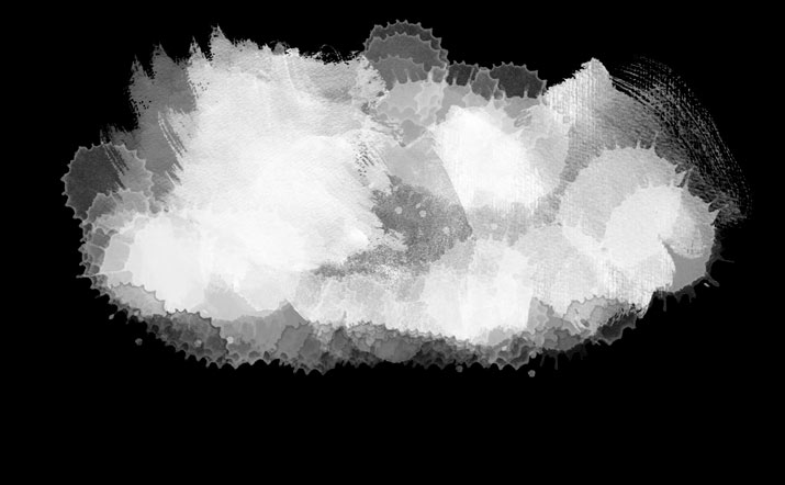
This is what my layer mask in the color image layer looked like:

color image layer mask

Color Image Layer Mask

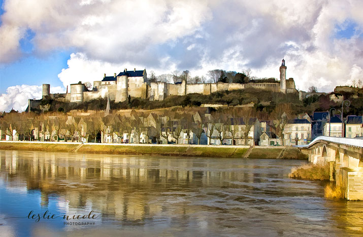
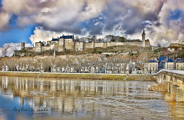
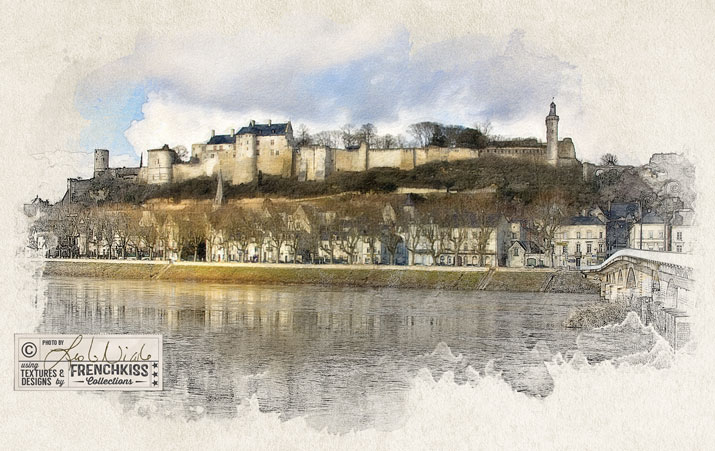
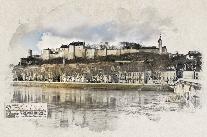
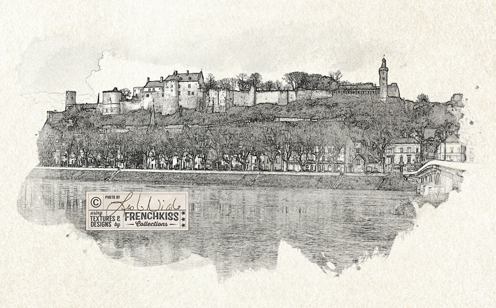
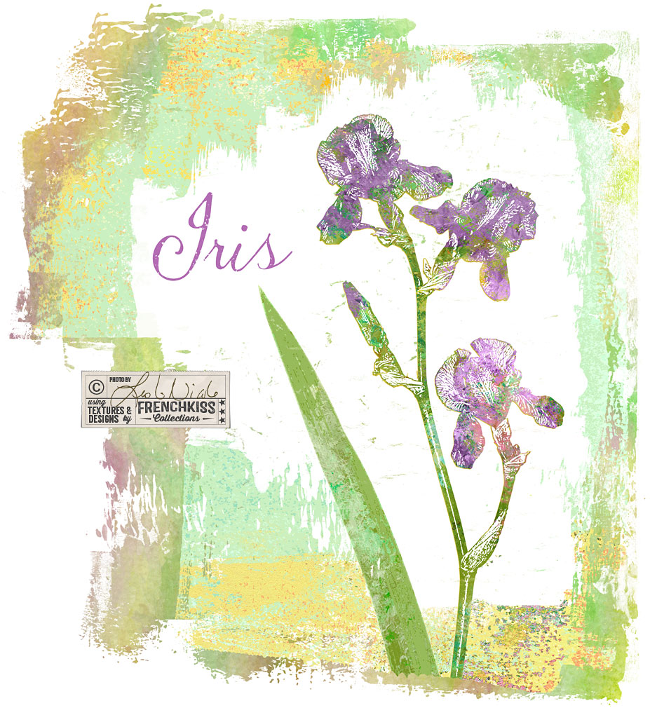
And here is my Final

Note: my original illustration was made several years ago, so it was hard to duplicate it exactly. This is a version with new layer masks.

Leslie Nicole Chinon final redo

Final Image (with new layer masks.)

Conclusion

All those steps may make this technique seem complicated, but it’s actually quite easy. Please do let me know if anything needs to be clarified for you. Have fun!

Resources

Les Textures 3

French Kiss Collections Watercolor Brushes and Overlays

Creating A Photo Illustration Effect Using Watercolor Brushes. A tutorial in 4 parts.

  1. Part 1: An overview of what will be covered.
  2. Part 2: Preparing the Color Photograph.
  3. Part 3: Creating the Black and White Line Illustration.
  4. part 4: Putting it all together and using the watercolor brushes. (This post)

Iris Flower With Photoshop Filters

$
0
0

In the last post, I showed you my set up for photographing an iris flower intended for my designs. In this post, I share my creative Photoshop filter explorations.

The Master File

I’m not going to go into great detail on my master file preparation – I’ll cover that in another post, but basically I do all my retouching, file cutout, and clarity work first so I have a good base to work from. For around 90% of my master files I like to use the *Topaz Labs Clarity filter. I’ll sometimes use the *Topaz Labs Detail filter or the Nik filters.

Master photoshop file

Creative Filters

After I have my cutout, retouched, and tuned master file, I start exploring different creative filters.

Filters Used For This Image:

  • *Topaz Labs Clarity, Clean, Simplicity, BW Effects, and Impression filters.
  • Photoshop’s Filters: Artistic/Cutout. Sketch /Conté, and Stamp.
The Photoshop Artistic filters only work on 8 bit images! If it isn’t showing up, check the Image/Mode menu.

Click for lightbox viewing

Topaz Labs Simplicity Topaz Labs Sketch filter Topaz Labs Impression Painting filter Photoshop Artistic Cutout filter Topaz Labs Clarity and Clean filters Topaz Labs Clarity filter Topaz Labs BW Effects Photoshop Conte Filter Photoshop Stamp Filter

I’ll try to show you some of these in use in later posts. I played around with an interesting effect using the Photoshop /Sketch / Stamp version as a mask for a texture.

Resources

* *Topaz Labs Filters is an affiliate link. I get a small commission from any sales resulting from a click from this site (at no extra cost to you.) I really do love these filters. Nearly all of my own images use one of these filters. Thank you for supporting the site!

Save

Save

Save

Save

Save

Save

Save

Save

Save

Using The Photoshop Stamp Filter To Create A Design Element

$
0
0

In the last post where I showed you my Photoshop filter exploration on an iris photograph, one of my examples was using the Photoshop / Sketch / Stamp filter. In this post, I want to show you how I used that filter result with a texture to create a design element.

iris photograph design motif.

Notes On the Photoshop Stamp Filter

If you can’t find the Artistic or Sketch filters in the menu, read this article.
  • The Stamp Filter is found under Photoshop menu: Filter / Sketch / Stamp. If it is grayed out, your file must be changed to 8 bit. Note: you can also just open up the Photoshop Filter Gallery and then use the expanding folders to choose the Sketch category.
  • Must Be 8 Bit: Many of the native creative Photoshop filters including Artistic and Sketch only work on 8 bit files. If you are shooting RAW file photographs, they will probably be 16 bit, so you will need to save a copy of your master photograph and change it to 8 bit. (Menu-Image / Mode / 8 bit.)
  • Pre Filter – Clarity: I created my Stamp filter element from a file on which I had first used the *Topaz Labs Clarity and the Photoshop/Artistic/Cutout filters. I always use the *Topaz Labs Clarity or Detail filters on my master photographs and I do think this creates more detail for the further creative filters. If you don’t have the Topaz filters, just try to get your image sharp and detailed and that will be perfectly fine.
  • Pre Filter – Cutout: I then used the Photoshop Artistic / Cutout filter to further simplify the details before using the Photoshop Sketch / Stamp filter. In testing, I did get better results using the Stamp filter by using the Cutout filter first.
  • Play with the sliders to get the results you want. As you slide the top slider, you’ll notice that the amount of black increases and decreases. Smoothness will smooth out the edges of details.
Photoshop Sketch Stamp settings

Photoshop’s Sketch / Stamp filter opened in the filter gallery.

Creating The Floral Design Element

  • A. The Original Photoshop/Sketch/Stamp file. Remember that the original iris photograph was cut out from the background, so the Stamp filter gave us a file with the background cut out, but the interior of the flower is white.
  • B. Transparent: I saved a copy of the Stamp file and made all white areas transparent. (Note. I want to do an entire post on how I create transparent files, so I won’t go into detail on this here.) My apologies, I’ll get to this soon and update the post with a link.)
  • C. White Fill and Stroke: I made another copy of the original Stamp file (A.) and made a selection of the flower by Command clicking the layer. (Control for PC) I then filled that selection with white. Option + Delete (Mac) Alt + Backspace (PC) with white as the foreground color. Then, I added an outer stroke using a layer effect. (Bottom of the layer panel, click the fx icon and choose the stroke option from the fly-out menu.)

The design element base.

Adding The Texture

I then added a painterly texture and used a clipping mask to constrain the texture to the transparent element layer.

Detail with texture added.

The Layer Panel For the Iris

Here, you can see how the white filled element and transparent element from above are used. The texture is added with a clipping mask. (Check this post on using textures with a clipping mask. It’s with text, but it’s the same method.)

  • The white filled flower with the outer stroke becomes the white interior background for the flower.
  • The transparent black iris is used with a texture and a clipping mask. The clipping mask constrains the texture to the non-transparent areas of the layer it is being clipped to.
  • The texture was darkened with a levels adjustment layer.
  • More purple was added with a grunge brush in the areas with the iris flowers.
  • I added selective burning in an overlay layer. (Filling with 50% gray is only so it’s easier to see the brush. Because the Overlay blend mode is a contrast blend mode, it doesn’t see 50% gray!)

Photoshop layer panels

Usage Idea

This is a “doodle” I’m not sure what I will do with it but that’s where ideas come from – playing around and trying things. I thought it might be interesting to create a pattern with maybe 6 different flowers and a background. Maybe I’ll just end up stealing parts of this for something else! What I really wanted to show was how it’s possible to create an illustration from a photograph using basic Photoshop filters.

Flower motif in a design

Resources

  • *Topaz Labs  Filters is an affiliate link. I get a small commission from any sales resulting from a click from this site (at no extra cost to you.) I really do love these filters. Nearly all of my own images use one of these filters. Thank you for supporting the site!
  • Find Grunge brushes and masks in the French Kiss Collections Shop.
  • Texture is Merengue (with additional color) from the Impasto Fresca collection.

Save

Save

Save

Save

Save

Rose Photograph Plus Texture Plus Impression Filter

$
0
0

I love combining a photograph, a texture, and the Topaz Labs Impression Filter to create a digital painting.

Combining a rose photo, a texture and the Impressions filter.

The Original Photograph

Usually, when I create textured florals, they are photographed in the studio with a plain background which will make it easier to apply a texture (when you want the texture to be the background). In this exception, I couldn’t help selecting these roses that I photographed in the gardens of the Château du Rivau in the Loire Valley (Love this château!). I took this photograph a number of years ago so back then I was using a Canon 40D. I think I just used the kit 28-135mm lens for this macro.

With A Texture

Because I wanted to cover up the background leaves, the texture was used in Normal Blend Mode in Photoshop. A layer mask allowed me to cover the background and also softly cover the flower a little so it blends into the background. See image below.

I chose the texture Autumn Glow from the Autumn Rain watercolor texture collection. (Note – at one point, this was a free texture, so check to see if you have that texture).

Topaz Labs Impression Filter

I love, love, love the *Topaz Labs Impression Filter! Adding a painted texture to your photograph already takes your image to a more artistic expression and the Topaz Filter unifies the photograph and texture.

The *Impression filter is now part of the *Topaz Labs Studio which works as either a stand alone program or through Photoshop and Lightroom. While it looks like Studio has interesting features, personally I won’t be abandoning my Lightroom / Photoshop workflow. I prefer to access it through Photoshop.

The flower in its 3 stages

  1. Original rose photographed in garden with green leafy background.
  2. Rose with a watercolor texture. Autumn Rain watercolor texture collection.
  3. Textured photograph with the *Topaz Labs Impression Filter. I chose the Impressionistic / Impasto preset.

Rose photograph before and after

Here’s another subtler version with the Impressionistic / Renoir setting

Texured rosed with Topaz Labs Impression Renoir filter.

*Topaz Labs Filters is an affiliate link. I get a small commission from any sales resulting from a click from this site (at no extra cost to you.) I really do love these filters. Nearly all of my own images use one of these filters. Thank you for supporting the site!

Save

Save

Save

Self Portrait With Textures And Impression Filter

$
0
0

Here is a self-portrait I did with textures added and then finished with the *Topaz Labs Impression painterly filter.

Self portrait digital painting

Original Photograph And Textures

  • Self portrait photograph: (taken in 2014) taken with my Canon EOS 5D Mark III and the Canon 85mm f/1.2L lens. I did do a little retouching.
  • The Textures: This has 2 textures. I’ll do another post some time on how it was done. Note how the texture also brought light and warmth to the face and skin. Yes, you can also do that in retouching, but bringing a little glow to an image is something you can get with textures. The main texture used for the background and shirt coloring was Forty Niner from the Les Textures I collection. The texture was slightly blurred.

Original photograph and with textures.

With Topaz Labs Impression Filter

I quite like the textured photograph, but I love the energy and motion that that the *Topaz Labs Impression painterly filter adds. I’m usually good at naming my layers with the preset I used, but this time, I’m not sure! I do know that I used the Oil Paint II preset for the face and skin areas and I used either the Impasto or Monet I preset for the background. I often do 2 variations; one with small brush strokes and the other with large brush strokes and then I use a layer mask to choose which areas I want to have finer detail.

Tip: combine 2 Impression versions with different brush sizes with a layer mask.

The *Impression filter is now part of the *Topaz Labs Studio which works as either a stand alone program or through Photoshop and Lightroom. While it looks like Studio has interesting features, personally I won’t be abandoning my Lightroom / Photoshop workflow. I prefer to access it through Photoshop.

Here’s the final image again.

Portrait with textures and the Topaz Impression filter.

*Topaz Labs Filters is an affiliate link. I get a small commission from any sales resulting from a click from this site (at no extra cost to you.) I really do love these filters. Nearly all of my own images use one of these filters. Thank you for supporting the site!

Save

Save

Viewing all 14 articles
Browse latest View live


Latest Images